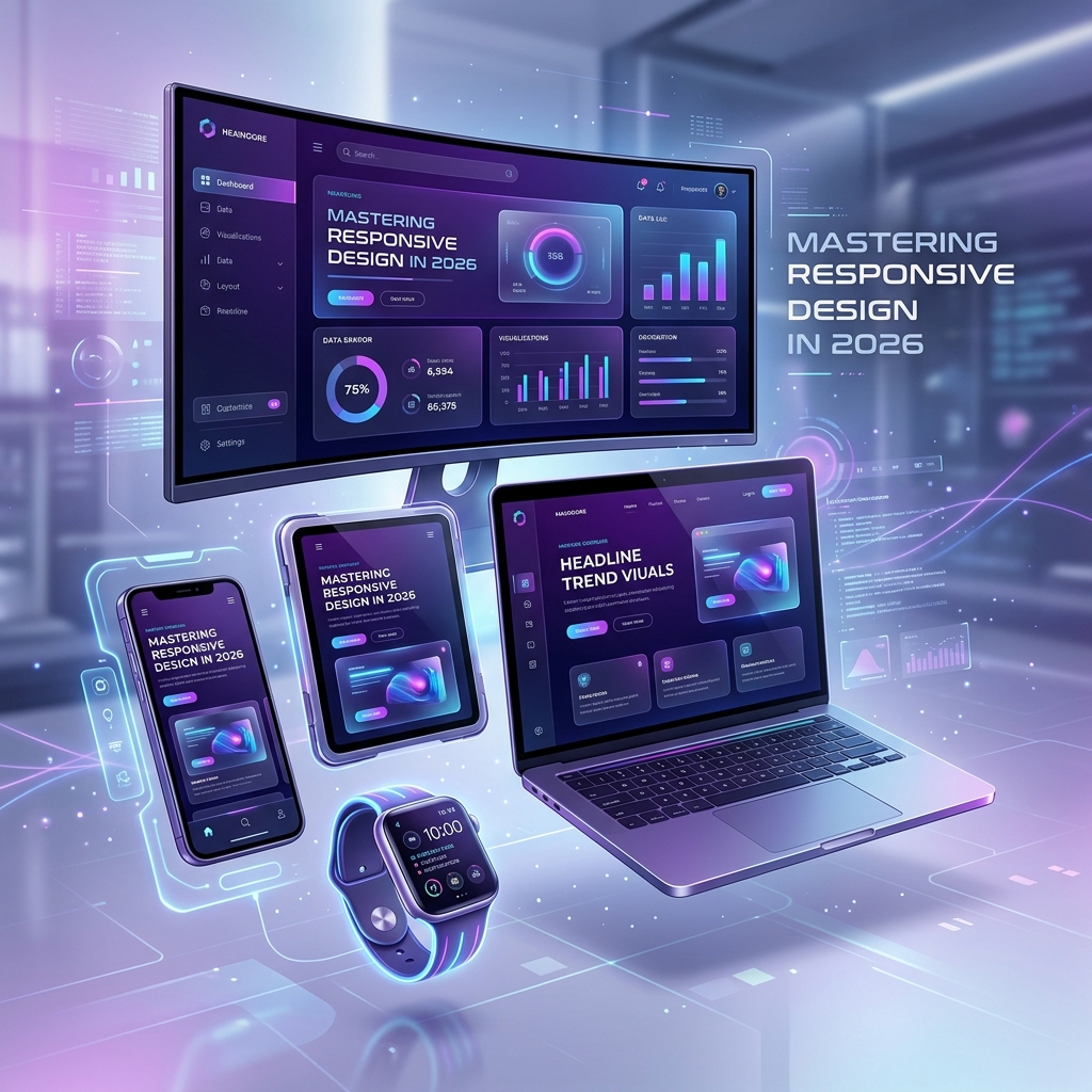
Mastering Responsive Design in 2026: A Comprehensive Guide
NovaEdge Tech Analyst
Lead Strategist
Explore the cutting-edge techniques and principles of responsive design in 2026. Learn how to create seamless user experiences across all devices, from smartwatches to ultra-wide monitors.
Mastering Responsive Design in 2026: A Comprehensive Guide
Responsive design has evolved far beyond simple media queries and basic grid systems. In 2026, the 'Living Web' demands interfaces that don't just shrink and grow, but intelligently adapt to user context, device capabilities, and environmental factors. This guide explores the cutting-edge techniques that define modern web development.
1. The True Modular Revolution: Container Queries
For over a decade, we were tied to the viewport. Every layout decision was based on how wide the entire window was. In 2026, container queries are the gold standard. They allow a component to look at its direct parent and decide how to lay itself out.
Imagine a 'Card' component. In a sidebar, it should look like a small list item. In a main content area, it should expand into a full-width hero. With container queries, that logic lives inside the component, making your design system truly portable and robust.
2. Fluid Typography with CSS clamp()
Stop writing dozens of media queries just to change font sizes. Modern responsive design uses fluid typography via the clamp() function. By defining a minimum, preferred (relative to viewport), and maximum value, your text scales smoothly across all devices.
Example: font-size: clamp(1rem, 5vw, 2.5rem);. This ensures your headings are never too small on a phone or too comically large on a 5k monitor. It's about readability at every scale.
3. The Foldable Future: Multi-Screen UX
Foldable and dual-screen devices have moved from niche to mainstream. 2026 developers must use the viewport-segment CSS properties to detect the 'hinge' or 'fold' and ensure content isn't obscured. Designing for 'spanned' states is now a core requirement for premium web applications.
4. Performance: Core Web Vitals in 2026
Responsiveness isn't just visual; it's about speed. Using modern formats like AVIF for images and WOFF2 for fonts is mandatory. More importantly, implementing 'Selective Hydration' ensures that only the interactive parts of your responsive layout load their JavaScript, keeping your LCP (Largest Contentful Paint) under 1.2s even on slow mobile networks.
5. AI-Driven Layout Optimization
The latest trend involves using lightweight AI models to generate layout variations for thousands of possible screen dimensions. At NovaEdge Digital Labs, we use these tools to stress-test our designs, ensuring that even the most obscure 'in-between' sizes offer a premium user experience.
Conclusion: Building for the Unknown
Mastering responsive design in 2026 means embracing uncertainty. We no longer design for 'Mobile' or 'Desktop'; we design for capability. By leveraging container queries, fluid scaling, and modern performance standards, you create a web that truly lives anywhere.
Frequently Asked Questions
About NovaEdge Tech Analyst
NovaEdge Digital Labs is a team of designers, developers, and strategists dedicated to pushing the boundaries of digital innovation in 2026.
Learn more about the team